
We’re expanding the set of predefined templates in Synerise Mobile In-app to give teams an easier way to deliver interactive experiences without building every element from scratch. Each template is configurable, enterprise-ready and designed to reduce operational effort while improving how users interact with content inside your mobile app.
A key part of this release is flexible message resizing — a capability that lets a single in-app element switch between formats (e.g., bar → fullscreen → bar) depending on user behavior or device screen size. It simplifies the entire process of building dynamic experiences: one template, up to several display modes, fully configurable.
The result is simple:
You deliver richer, more engaging in-app journeys while reducing the operational overhead that usually comes with building them.
Find all of them in In-app > Templates > Predefined templates
Traditional in-app banners or modals are static. They show information, but they don’t invite users to do anything.
The new templates focus on:
A new capability that makes in-app messages more adaptive
Message resizing lets you dynamically adjust how an in-app message appears based on user behavior, device size or the moment of interaction.
This flexibility enables a wide range of scenarios — from lightweight discovery to deeper interactions, all inside a single template.
Below are the four new predefined templates, each using flexibility and interactivity in a different way.
A lightweight, ready-to-use memory game that brings a playful interaction into the app.
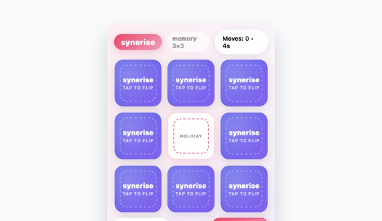
How it works:
Users match product images in a short game. Items can be loaded directly from personalised promotions or recommendation models, making the gameplay both fun and contextually relevant.
What it solves:
Why it stands out:
It blends a simple game mechanic with personalised content — a rare combination in standard mobile commerce experiences.
A template built specifically around resize behavior, combining subtle placement with expandable product discovery.

How it works:
It appears as a small top bar or bottom bar. After a tap, it expands into a larger view with personalised recommendations powered by your AI models.
What it solves:
Why it stands out:
One template handles the entire interaction path — a compact hint → a detailed recommendation view — without switching components.
This is currently the strongest example of flexible message resizing in action.
A visual template that delivers a story-like experience while staying adaptable.

How it works:
The experience starts as a small banner. When tapped, it enlarges to a fullscreen slide sequence, showing visuals, recommendations or curated content.
What it solves:
Why it stands out:
It’s a simple format for storytelling — not a static banner. And thanks to resizing, the user transitions smoothly from a hint to a full visual layout.
A template for connecting offline and online journeys through automated scanning.
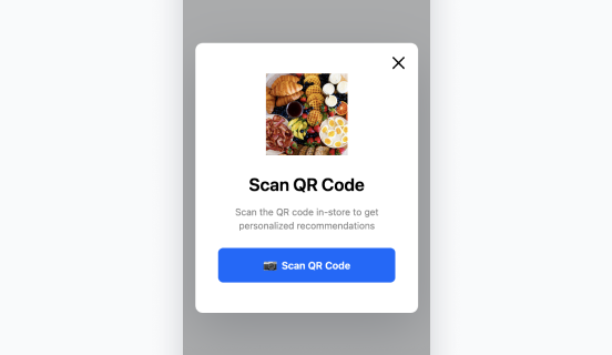
How it works:
When opened, the template automatically:
This ensures that the user lands on a fully personalised page immediately after scanning.
What it solves:
Why it stands out:
It removes the entire complexity of manual scanning, linking and identifying. You get a clean, trackable, personalised entrance from any offline moment.
We’re expanding the set of predefined templates in Synerise Mobile In-app to give teams an easier way to deliver interactive experiences without building every element from scratch. Each template is configurable, enterprise-ready and designed to reduce operational effort while improving how users interact with content inside your mobile app.
A key part of this release is flexible message resizing — a capability that lets a single in-app element switch between formats (e.g., bar → fullscreen → bar) depending on user behavior or device screen size. It simplifies the entire process of building dynamic experiences: one template, up to several display modes, fully configurable.
The result is simple:
You deliver richer, more engaging in-app journeys while reducing the operational overhead that usually comes with building them.
Find all of them in In-app > Templates > Predefined templates
Traditional in-app banners or modals are static. They show information, but they don’t invite users to do anything.
The new templates focus on:
A new capability that makes in-app messages more adaptive
Message resizing lets you dynamically adjust how an in-app message appears based on user behavior, device size or the moment of interaction.
This flexibility enables a wide range of scenarios — from lightweight discovery to deeper interactions, all inside a single template.
Below are the four new predefined templates, each using flexibility and interactivity in a different way.
A lightweight, ready-to-use memory game that brings a playful interaction into the app.
How it works:
Users match product images in a short game. Items can be loaded directly from personalised promotions or recommendation models, making the gameplay both fun and contextually relevant.
What it solves:
Why it stands out:
It blends a simple game mechanic with personalised content — a rare combination in standard mobile commerce experiences.
A template built specifically around resize behavior, combining subtle placement with expandable product discovery.
How it works:
It appears as a small top bar or bottom bar. After a tap, it expands into a larger view with personalised recommendations powered by your AI models.
What it solves:
Why it stands out:
One template handles the entire interaction path — a compact hint → a detailed recommendation view — without switching components.
This is currently the strongest example of flexible message resizing in action.
A visual template that delivers a story-like experience while staying adaptable.
How it works:
The experience starts as a small banner. When tapped, it enlarges to a fullscreen slide sequence, showing visuals, recommendations or curated content.
What it solves:
Why it stands out:
It’s a simple format for storytelling — not a static banner. And thanks to resizing, the user transitions smoothly from a hint to a full visual layout.
A template for connecting offline and online journeys through automated scanning.
How it works:
When opened, the template automatically:
This ensures that the user lands on a fully personalised page immediately after scanning.
What it solves:
Why it stands out:
It removes the entire complexity of manual scanning, linking and identifying. You get a clean, trackable, personalised entrance from any offline moment.


